Käänne Festival
Visual Identity
Käänne Festivaali, Korjaamo, 2024www.kaannefestival.fi/
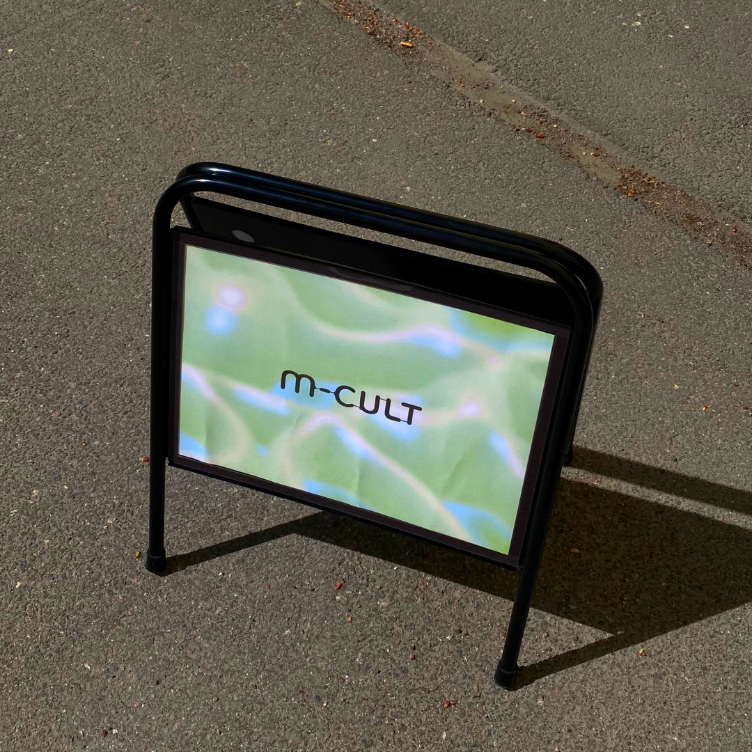
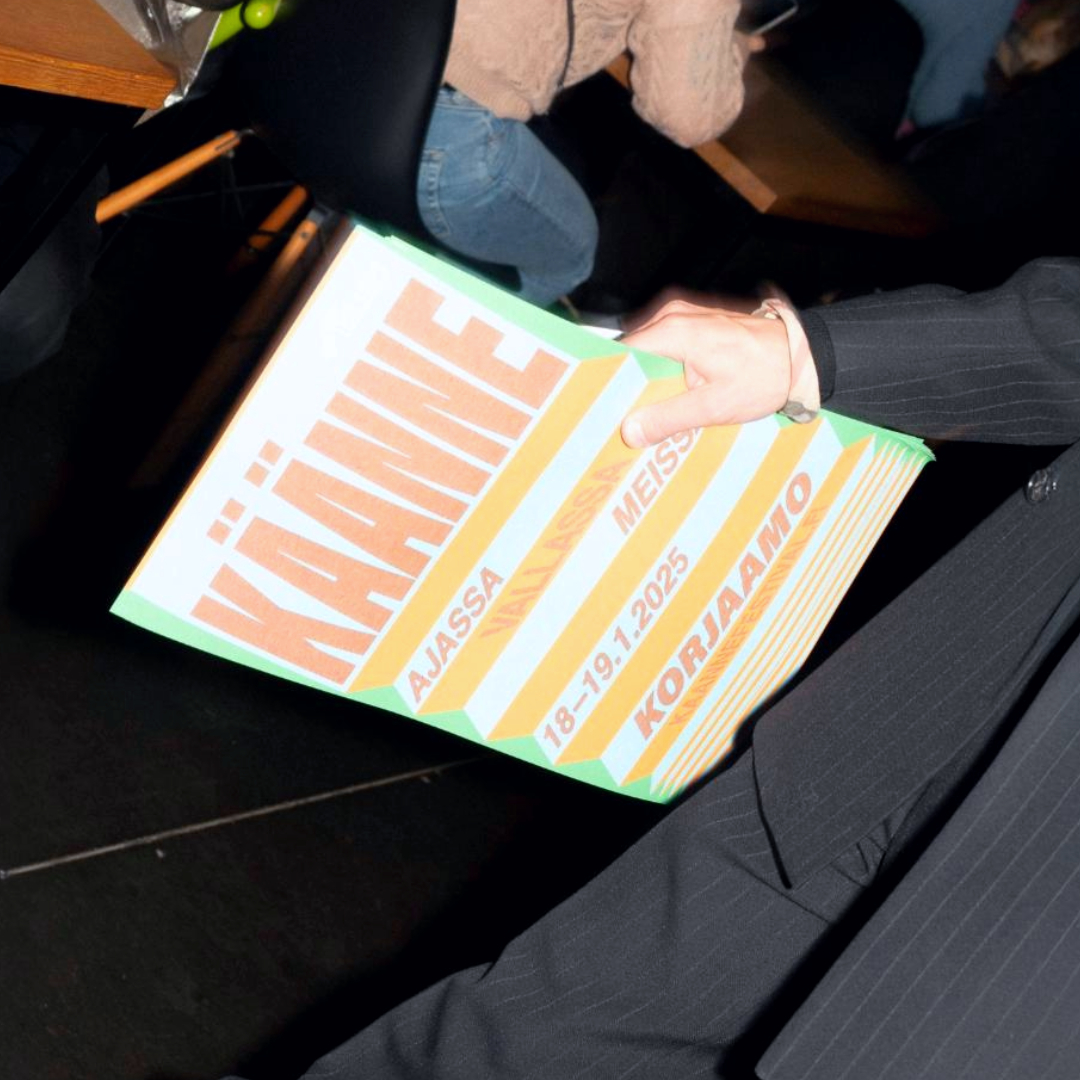
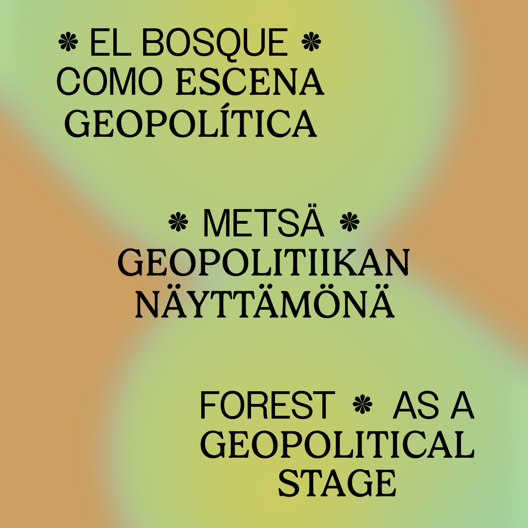
For Käänne Festival, the challenge was to create a visual identity that carried the festival’s political urgency but still felt open and inviting. Käänne means “turning point” in Finnish, so I started by asking people how they imagined the word visually—most described a sharp, sudden movement. That led to the central zigzag motif, which I first prototyped by hand with paper to explore rhythm and flow. The colour palette avoided direct political associations, leaning on neutral yet lively tones, while the typography stayed clear and adaptable for everything from social media posts to large banners. The result was a flexible system that could shift between playful and serious, always connected to the festival’s ideas of change and collective energy.
News article about the festival.
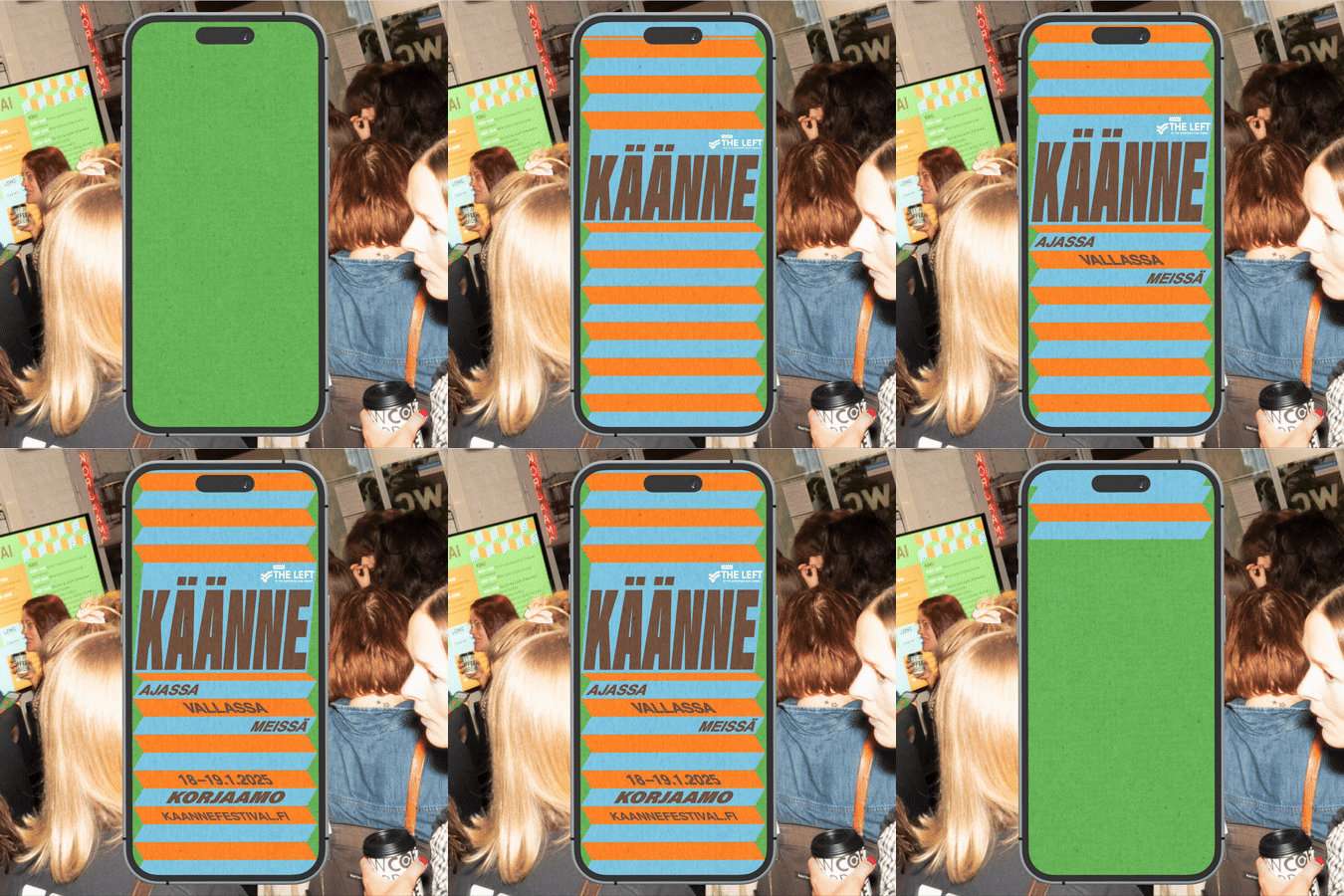


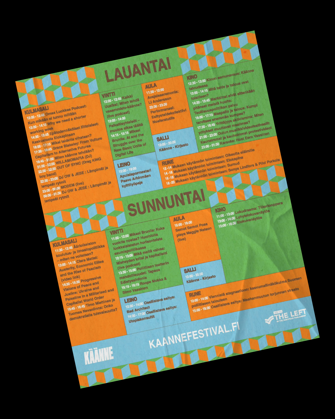
Event pictures taken by Juuli Kangasniemi
